User Experience
UX patterns and recommendations for integrating digital ID verification into your existing onboarding flow.
As digital IDs gain adoption, companies must design verification experiences that integrate emerging digital ID methods alongside existing options, enhancing the experience for users who have a digital ID, without disrupting those who don't. This document summarizes the key UX lessons from Trinsic's customer deployments.
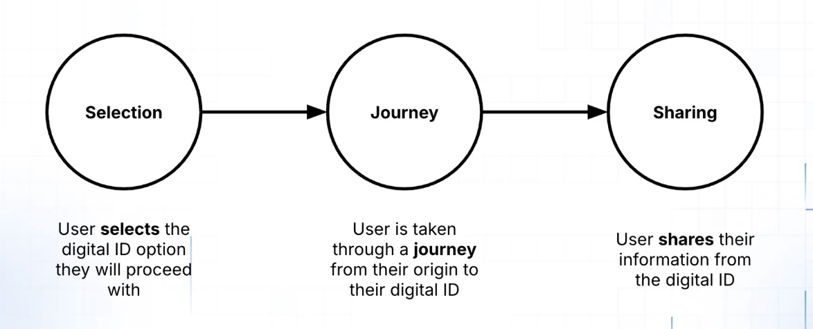
Phase 1 — Selection
The first step is selection: the moment users choose how they want to verify. Digital IDs should appear at the same decision point as document verification, on the "Choose verification method" screen alongside "Scan government ID," not as a separate fork earlier in the flow.
Recommendations
- Don't overwhelm with choices. Showing 2–3 relevant options converts better than a long list.
- Use geography as your key input. Derive it from signals you already have (phone number, IP, onboarding country) rather than forcing the user to choose upfront.
- Prioritize and filter. Put the most likely option first. If you know the user's device, geography, or prior selections, use that to surface the best method.
- Always include a fallback. Keep "Scan government ID" or document upload clearly available at the same decision point.
- Use correct provider branding. Follow provider brand guidelines for logos, names, and icons. Familiar, official branding increases completion and reduces hesitation.
Implementation patterns
Programmatic orchestration recommended
The cleanest option in most multi-provider environments. Call Trinsic's Recommendation API and receive the providers that actually make sense for that user — based on signals you already have (country, phone number, IP, returning user context). Providers are returned as "Relevant" or "Remainder," keeping the long tail behind "Show more." 📹 View a demo →
Geography-first selection
A country picker works well when geography drives provider availability and your flow already has a country selection step. Can be combined with programmatic orchestration as a fallback if auto-detection fails. Always allow an override — users may be traveling, using VPNs, or have mismatched signals.
⚠️ Manual button selection: not recommended for scale
A fixed list of buttons. Works only for small, tightly scoped deployments or compliance-driven flows where specific providers are required. Hard to scale, static lists get messy fast when adding geographies.
What to avoid
- Separating physical and digital ID flows early, integrate digital IDs into your existing verification flow instead
- Showing every provider to every user
- Letting static provider lists grow without filtering logic
- Asking users for information you already have
Phase 2 — Journey
Once a user selects a provider, the focus shifts to execution. After selection, teams typically implement one of two handoff patterns:
Spinner (embedded)
The user stays in your product while verification runs. Always include a clear exit or fallback so users don't feel trapped.
Full redirect
The user is sent to a hosted provider experience and returned afterward. Requires clear messaging so users know they're leaving and coming back.
In both cases, avoid dead ends. Every journey should include a clear way to:
- Return to provider selection
- Choose a fallback method
- Retry without restarting the entire onboarding process
Phase 3 — Sharing
Verification doesn't end at completion. Strong post-verification experiences:
- Clearly confirm success or failure
- Guide users into the next onboarding step
- Reinforce legitimacy and trust
- Make it easy to present or reuse credentials when relevant
Choosing the right approach
The decision comes down to three questions:
- What signals do you already have about the user?
- How many providers need to be surfaced at once?
- Are you optimizing for implementation simplicity or long-term conversion performance?
In most multi-region or multi-provider environments, some form of filtering (orchestration or geography-first) will perform materially better than static button lists.
Updated about 1 month ago